<
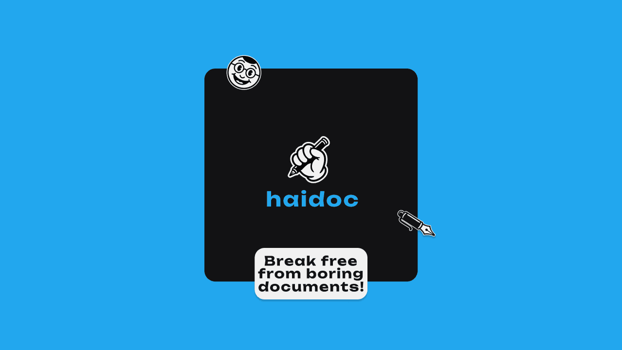
Haidoc - Logo design
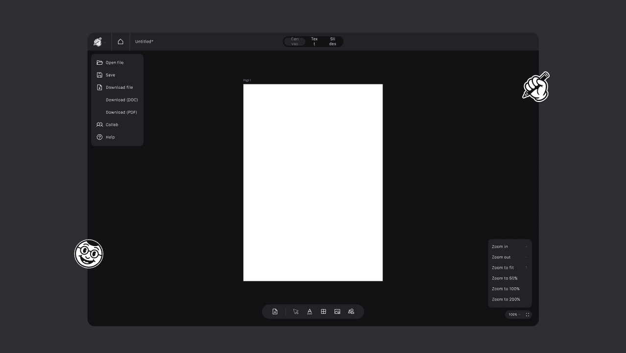
The Client: Haidoc is a document editor that brings a canvas-based, design-tool experience to everyday writing — letting users create, edit, and export documents in DOC and PDF formats with a fluid, visual-first interface.
The Issue: The product needed a brand identity that broke away from the stiff, corporate feel of traditional word processors, while still signaling that it was a serious tool for real document work — not just another novelty editor.
The Solution: A logo was designed around the idea of writing with intention — combining a bold, hand-drawn energy with a clean typographic lockup. The mark uses a fist gripping a pen to project confidence and creative ownership, paired with a friendly character mascot to keep the tone approachable and distinctly un-corporate.



Other projects you may like: